
Have you ever walked into a room and immediately felt a wave of calm wash over you? Or conversely, stepped into an office that made you feel instantly agitated and drained, even though you couldn’t quite put your finger on why?
I know how it feels. A few years ago, I was struggling with severe anxiety. I tried everything—meditation, decluttering, buying endless house plants—but my home office still felt like a cage. It wasn’t until I stumbled upon the psychology of color that I realized the problem wasn’t me; it was the stark, sterile grey walls surrounding me 12 hours a day.
Your environment isn’t just a backdrop; it’s an active participant in your mental health.
In this guide, we are going to dive deep into how color frequencies interact with your brain. By the end of this “Life Record,” you will have the tools to audit your environment and paint your way to a happier, more focused life.
Table of Contents
Understanding the Psychology of Color
The psychology of color is the study of how different hues determine human behavior, mood, and physiological reactions. It isn’t just magic or Feng Shui; it is rooted in how our eyes perceive light and how our brains interpret those signals.
When light strikes your retina, it converts into electrical impulses that travel to the hypothalamus. This is the part of your brain that governs:
- Hormones (Cortisol, Melatonin)
- Appetite
- Body Temperature
- Sleep Cycles
Key Takeaway: Color doesn’t just look pretty. It signals your body to either wake up, calm down, feel hungry, or stay alert.
As an editor who has covered personal development for over a decade, I’ve seen countless people try to “hack” their productivity with apps, only to realize their environment was sabotaging them.
The Spectrum: Warm vs. Cool Colors
Before we pick up a paintbrush, we need to understand the two main families on the color wheel. The emotional temperature of a room is dictated by this split.
1. Warm Colors (Red, Orange, Yellow)
These are the colors of the sunset and fire. They are stimulating.
- The Vibe: Energy, passion, warmth, and sometimes anger or hostility.
- Physiological Effect: Can raise blood pressure and increase metabolism.
2. Cool Colors (Blue, Green, Purple)
These are the colors of water, sky, and nature. They are receding colors.
- The Vibe: Calmness, sadness, focus, and relaxation.
- Physiological Effect: Lowers heart rate and respiration.
Decoding the Colors: A Psychological Guide
Let’s break down the specific psychology of color for the most common hues used in our environments.
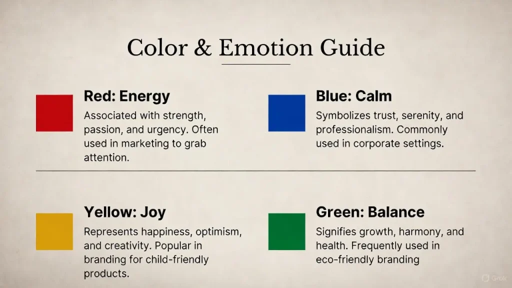
🔵 Blue: The Mind’s Soother
Blue is widely considered the most productive color. It stimulates the mind rather than the body.
- Best For: Focus, clear thought, and calming anxiety.
- The Downside: If it’s too dark or grey-heavy, it can evoke feelings of coldness or sadness.
- SoulDairy Insight: I use a soft “Duck Egg Blue” in my journaling corner. It instantly signals my brain that it is time to reflect.
🟢 Green: The Balance of Nature
Green strikes the eye in such a way that it requires no adjustment, making it the most restful color for the human eye. It sits right in the center of the spectrum.
- Best For: Long-term reading, restoration, and living rooms.
- The Downside: “Sickly” yellow-greens can cause feelings of nausea or unease.
🟡 Yellow: The Emotional Agitator
Yellow is tricky. In the psychology of color, it is the strongest psychological color.
- Best For: Confidence, optimism, and creativity (in small doses).
- The Downside: It is the most difficult color for the eye to take in. Studies show that babies cry more in yellow rooms, and couples fight more in yellow kitchens. Use it as an accent, not a main wall.
🔴 Red: The Physical Stimulant
Red grabs attention. It creates a sense of urgency (think stop signs or clearance sale tags).
- Best For: Dining rooms (stimulates appetite) or spaces where you want high physical energy.
- The Downside: Can increase irritability and is generally not suitable for bedrooms where you need to wind down.
Pro Tip: Cultural Context Matters. While White represents purity in Western cultures, it represents mourning in many Eastern cultures. Always consider your personal and cultural associations with a color before painting!
Read Also : Psycological Todayor Healthline
Room-by-Room Guide for Mental Wellness
Now that we understand the theory, how do we apply this to our “Life Record”? Here is how to map the psychology of color to your home.
1. The Bedroom (Rest & Restoration)
Goal: Low energy, high relaxation.
- Best Colors: Lavender, Sage Green, Slate Blue, Soft Grey.
- Avoid: Bright Red, Neon Yellow.
2. The Home Office (Focus & Flow)
Goal: High focus, low stress.
- Best Colors: Blue (for deep work), Green (for long hours), Off-White (for clarity).
- Avoid: Stark White (can cause glare and eye strain).
3. The Kitchen & Dining (Social & Appetite)
Goal: Warmth, conversation, hunger.
- Best Colors: Warm whites, Pumpkin, Terracotta, Soft Red accents.
- Avoid: Blue (evolutionarily, blue food is often spoiled or poisonous, so blue serves as an appetite suppressant!).
4. The Living Room (Connection)
Goal: Relaxation and social harmony.
- Best Colors: Earth tones, Beige, Soft Green, Warm Grey.
- Avoid: Dark Purple or Black (unless you have excellent lighting, this can feel depressive).
Read Also Another Souldairy Post: 10 Proven Ways to Stop Overthinking and Anxiety Today
A Personal Reflection: When I Painted My Office
I mentioned earlier that I used to work in a grey box. It was a trendy “industrial chic” look, but after six months, my motivation tanked. I felt lethargic every time I sat at my desk.
I decided to apply the psychology of color principles I was researching. I painted the wall behind my monitor a deep, forest green (biophilic design) and added accents of warm wood and orange.
The result?
- Eye Strain Reduced: The green was easier on my eyes than the reflective grey.
- Mood Shift: The orange accents provided a “pop” of energy when I looked away from the screen.
- Ownership: Taking control of my environment made me feel empowered in my work.
If you are feeling stuck in life, sometimes the easiest first step isn’t a new career or a new relationship—it’s a new coat of paint. Relevant SoulDairy post: "My Life Story of Emotional Overwhelm"
Interactive: The Home Mood Audit
Take 5 minutes right now to walk through your home. Look at your three most-used rooms and ask:
- How do I feel when I enter this room? (Tense, sleepy, energized?)
- Does the color match the activity? (e.g., Is your bedroom a high-energy yellow?)
- Is the lighting helping or hurting? (Color looks different under warm vs. cool bulbs).
FAQ: Common Questions About Color
What is the most relaxing color for anxiety?
Soft blues and greens are generally the most effective for reducing anxiety. specifically, Cool Blue affects the autonomic nervous system to lower blood pressure, while Pale Green reduces muscle tension.
Does color psychology actually work?
Yes. While personal preference plays a role, research in environmental psychology shows that color frequencies impact brain waves and hormonal secretions universally, regardless of taste.
What color is best for depression?
Avoid dark, gloomy colors. While you might gravitate toward them when feeling low, soft yellows (optimism) or warm greens (life/growth) can help lift the spirit gently without being overwhelming.
Can white walls affect my mood?
Yes. Pure, brilliant white can feel clinical and sterile, potentially leading to feelings of isolation. It is better to choose an off-white or cream with warm undertones to make a space feel inviting.
How do I use red without being aggressive?
Use the 60-30-10 rule. Let neutral colors take up 60% of the room, a secondary color 30%, and use Red as the 10% accent (pillows, art, a vase) to inject energy without raising your blood pressure.
Conclusion
The psychology of color is a powerful tool in your personal development toolkit. It is one of the few variables in life that you can completely control.
By being intentional about the hues that surround you, you aren’t just decorating; you are curating your emotions and protecting your mental energy.
Start small. Maybe it’s just changing your bedspread or painting one accent wall. Observe how your mood shifts. Remember, your home should be the place where you feel most like you.
What is the dominant color in your home right now, and how does it make you feel? Let me know in the comments below—I’d love to hear your experiences!